Monday, November 30, 2009

appeal to fear

contemporary advertising


historical propoganda


Friday, November 6, 2009

Russian Suprematism and Constructivism


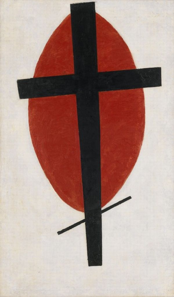
Kasimir Malevich Mystic Suprematism (black cross on a red oval). 1920-1922.


1926. Film poster for the The Battleship Potemkin by Alexander Rodchenko


El Lissitzky 1919 "Beat the Whites with the Red Wedge."

The movement is often characterized by the use of simple geometric shapes and sharp contrasting colors. Red and white are often used in tandem to represent both the soviet movement and the white counter revolutionaries they defeated. The geometric and abstract qualities of the art is in many cases very similar to the cubist movement that was popular in the west during the same era, but in the case of Russian art, it was more frequently used for propaganda purposes.

Sunday, October 18, 2009


Sophie Taeuber-Arp

Military Guards (Die Wachen), 1918.

Sophie Taeuber was a Swiss Dada artist during the first half of the 20th century. This particular piece was created to be a marionette for a retelling of the 18th century play "The King Stag" by Carlo Gozzi.

I like this piece because it reminds me of some of the abstract stop motion animation work created by Tim Burton, and the band Tool.

Sunday, October 11, 2009


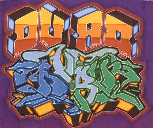
DURO

DURO is a graffiti artist in New York City who began writing in 1971. He's had many aliases and been associated with many groups, primarily the CIA (Crazy Inside Artists) of which he is vice president.

I don't know that graffiti pieces actually have titles, but i like this one because the shiny, gradient style reminds me of many of the album and magazine covers (like Heavy Metal magazine) that were popular at the time.

Aubrey Beardsley


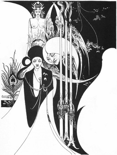
Aubrey Beardsley, Of a Neophyte, and How the Black Art Was Revealed unto Him by the Fiend Asomuel, 1893

Art Nouveau

Aubrey Beardsley was a Nouveau artist from England in last half of the 19th century. He died at the age of 25. His work is often very sexual, and much of his work served as illustrations of literary works like Salome and Lysistrata.

I like his work as his drawing style reminds me both of the Japanese print style that became popular in Europe, and the crisp black and white reminds me of some of the comic book work produced in the late 60s early 70s.

Friday, October 2, 2009


James Montgomery Flagg (June 18, 1877 – May 27, 1960)

found at http://www.britannica.com/EBchecked/topic/617597/The-United-States-Army

"I Want You for the U.S. Army" 1917

This is perhaps the single most iconic poster ever created in America. Every American is familiar with the image, and it was used to recruit members for both world wars. For many Americans, Uncle Sam represents the very spirit of patriotism, and the character has even been immortalized in a number of comic books by DC comics, such as the "Freedom Fighters"

While James Flagg himself may not be as much of a household word as Norman Rockwell or some other American artists, the image he produced easily trumps them.


Stefan Sagmeister

album cover: Lou Reed "Set the Twilight Reeling" 1996

found at http://bnn.tracingtheflow.com/projects/writing/

Stefan Sagmeister is an Austrian born graphic artist and typographer currently living in Indonesia. he has his own design firm, Sagmeister, Inc, that is based out of New York. He won a grammy award in 2005 for the artwork he did for a Talking Heads boxed set.

This particular piece appeals to me in large part because I am a fan of the musician, Lou Reed. the graffiti like writing on his face has a very urban underground look to it that suits his music. Also, the simple, handwritten quality of the text also suits the music which is often very low-key. It is also reminiscent of Pink Floyd's "The Wall" which further appeals to me.

Sunday, September 27, 2009

Aleksander Mikhailovich Rodchenko


Aleksander Mikhailovich Rodchenko was a Russian Constructivist artist during the first half of the 20th century.he was one of the most versatile Russian artists of the era, working as a sculptor, painter, photographer, and graphic designer. His work was often a blending of mediums, such as photographs set within paintings. his work featured bold, sharply contrasting colors.

Wednesday, September 9, 2009


Cat People
Designer: RKO pictures, no artist listed
December 6, 1942
The poster uses the contrast between light and dark to give the cat a sinister, evil presence. Most of these early posters appear to be designed to look like the covers of pulp fiction books that were popular at the time.


Ice Station Zebra
Designer: Robert McCall
October 23, 1968
This poster exhibits both tension and motion through the use of action. There is a lot going on with the airplanes, paratroopers, and submarine troops that makes looking at the poster almost like watching the movie itself.


Anatomy of a Murder
Designer: Saul Bass
July 1, 1959
The emphasis is on two words. Anatomy is emphasized both by cutting the images so that it looks like the male leads are staring voyeuristically at the female lead as well as the cut up figure that actually contains the title. Murder is illustrated by portaying the cut up anatomy as almost a chalk outline of a body at a crime scene.


Knowing
Designer: The Cimarron Group
March 20, 2009
Tension is created by showing the lower half of the Earth on fire. the contrast between black and color emphasizes the tension by making the planet look alone.